🎯 Define: User Personas
A flashcard app designed to make studying more effective and engaging through interactive learning methods
StudyNest is a flashcard app designed to make studying more effective and engaging through interactive learning methods. Built with students and self-learners in mind, StudyNest combines the simplicity of traditional flashcards with the fun of quick, memory-boosting games.
Supports consistent study habits and long-term retention by allowing users to create unlimited custom flashcards, organize them by topic, set study reminders, and reinforce learning through fun, interactive games.
UX/UI Designer
1 Month
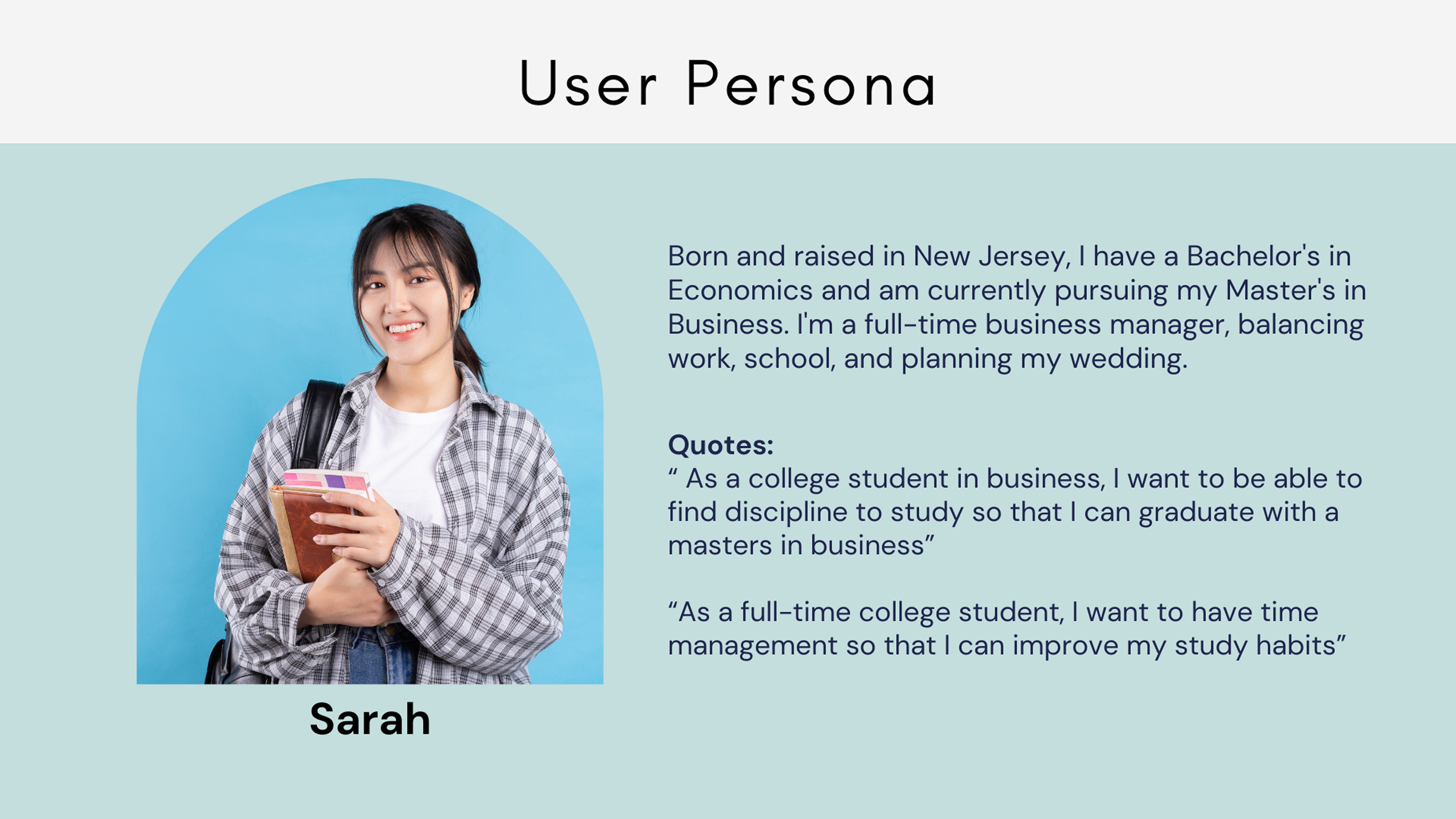
Users need a simple, centralized way to manage their study materials and learn new vocabulary effectively in one place.
I conducted interviews with 3 users to understand:
Some Questions I asked:
Participants often forget to review or lose motivation over time
Users prefer tools that are easy to navigate or not overwhelming
Engaging study methods make studying feel less like a chore
✅ Pros:
⚠️ Cons:
✅ Pros:
⚠️ Cons:
✅ Pros:
⚠️ Cons:
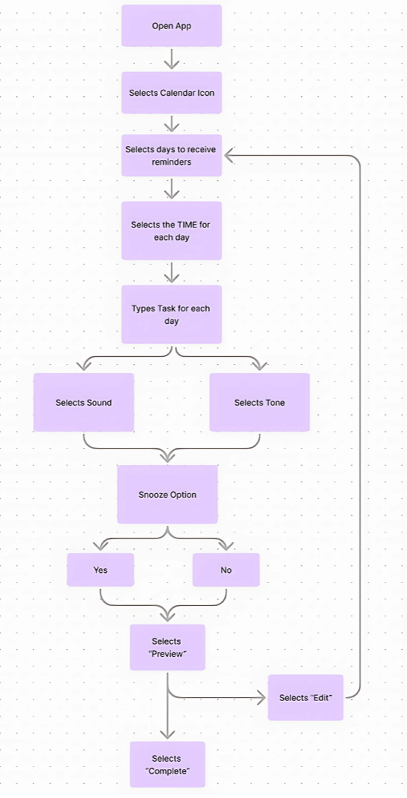
This user flow helps Sarah quickly set up a reminder, allowing her to stay consistent with her learning despite her busy schedule. By creating a personalized study schedule, she can build better habits and reduce the stress of last-minute cramming.
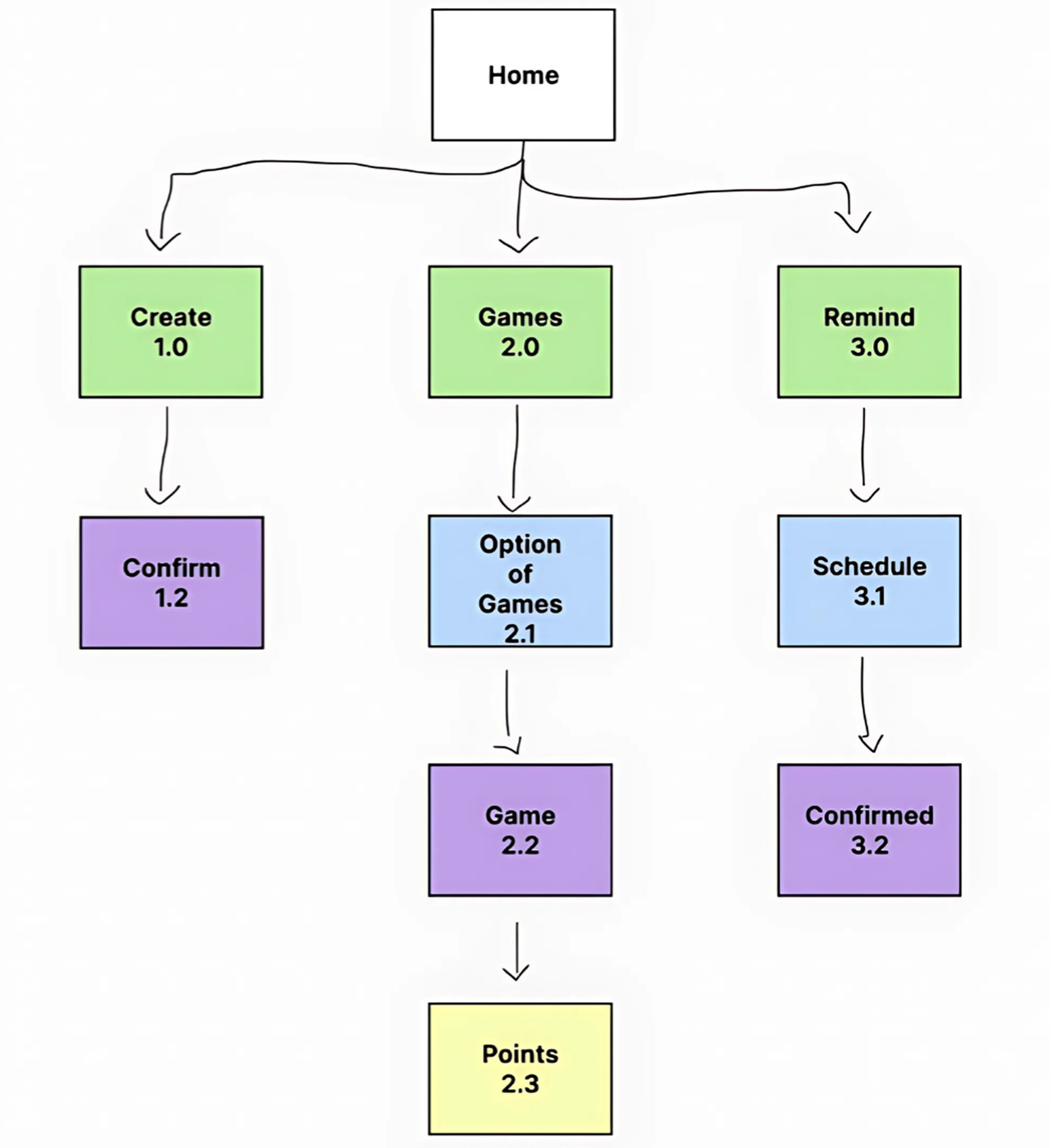
This sitemap visualizes the core structure of the StudyNest app. Providing users with a simple and organized navigation experience, helping users like Sarah efficiently access key features to support consistent and engaging study habits.

.png)
.png)
.png)
.png)
I conducted a usability test on 4 individuals. Each session lasted around 8-10 minutes, through Google Meet and Figma.
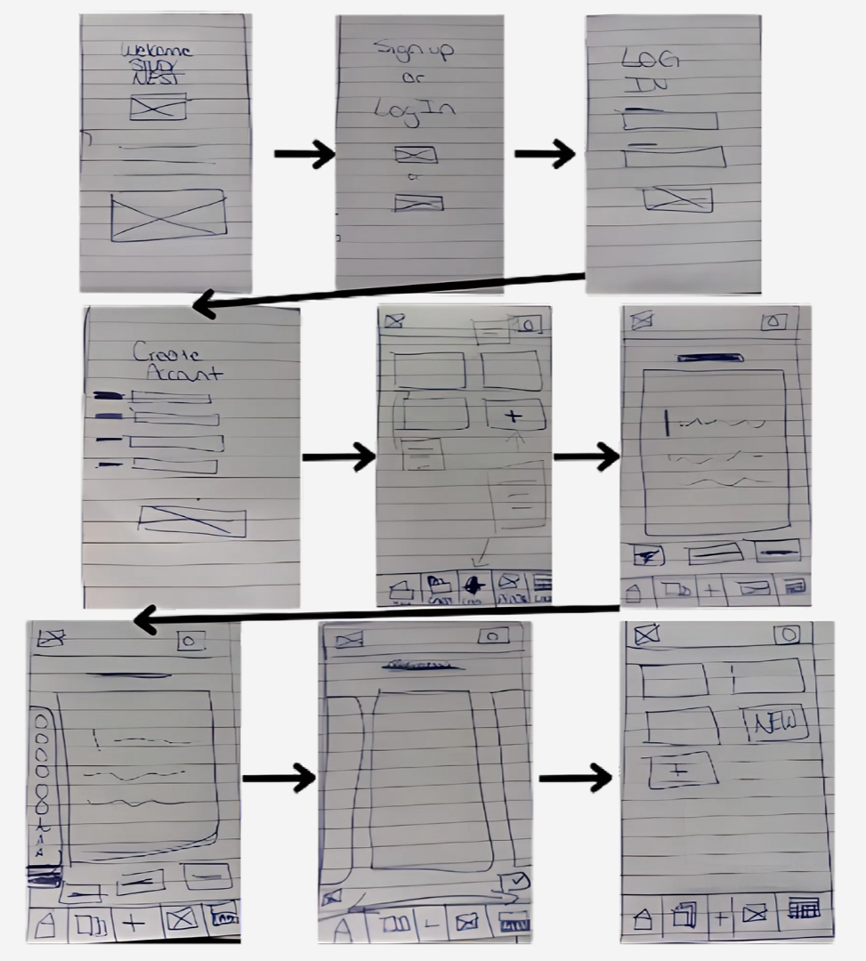
I had the testers complete two tasks using the mid-fidelity wireframe:
Users struggled with back navigation and unclear icons, especially for reminders
Users wanted to preview and edit cards and reminders after saving
Participants want to name decks and share cards
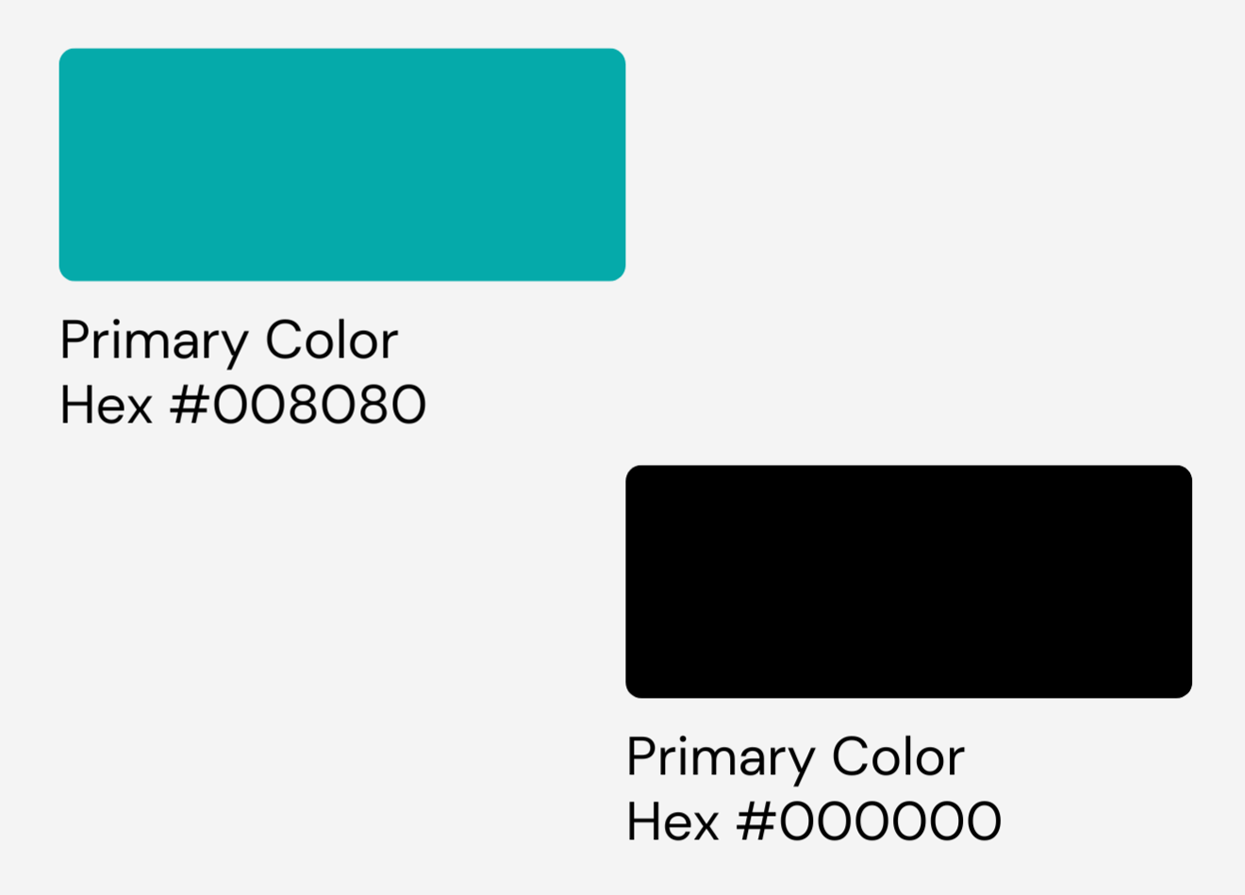
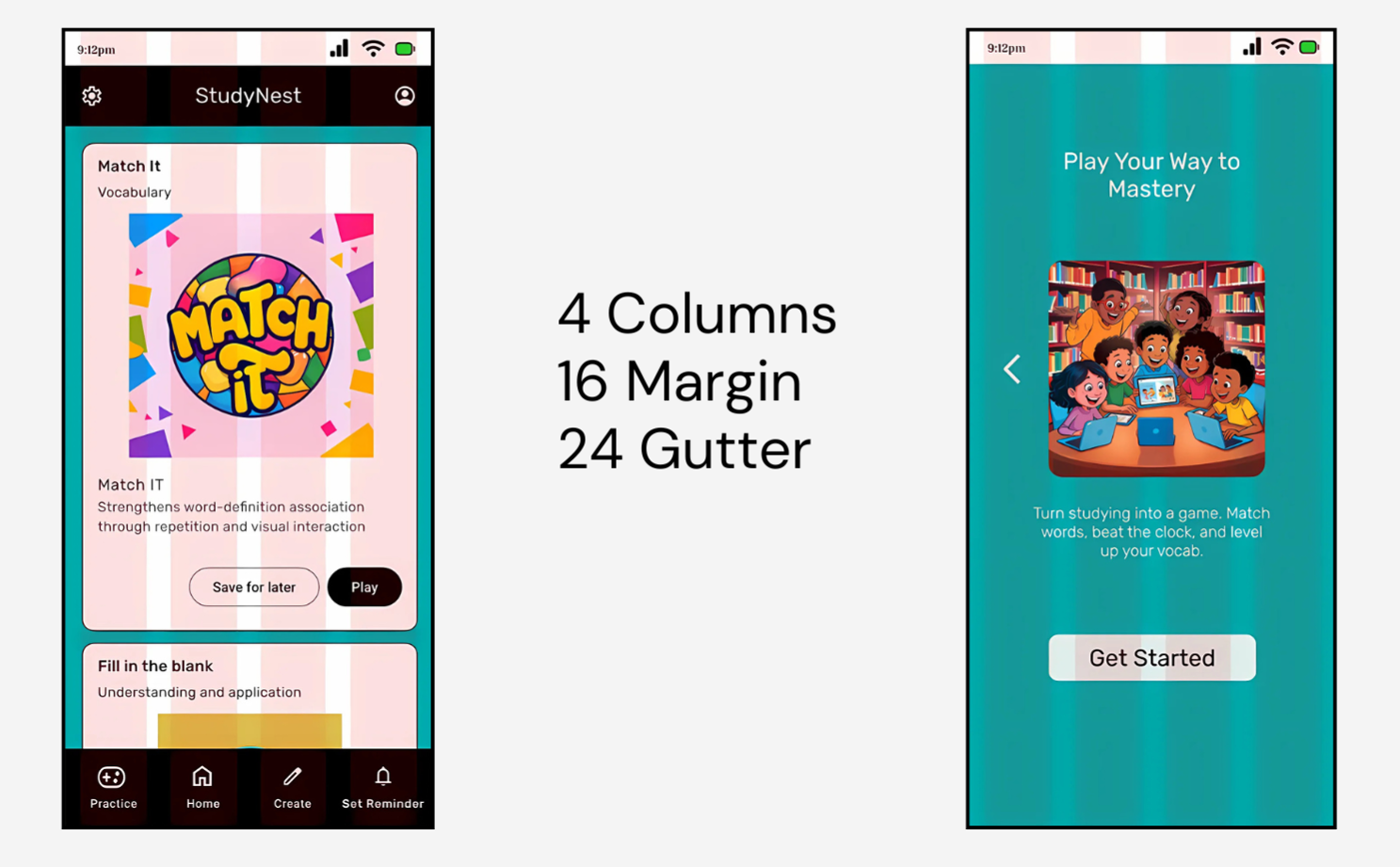
The mixture of teal and black as the primary colors of the app gives a perfect balance of calm and focus, making it ideal for a learning environment.
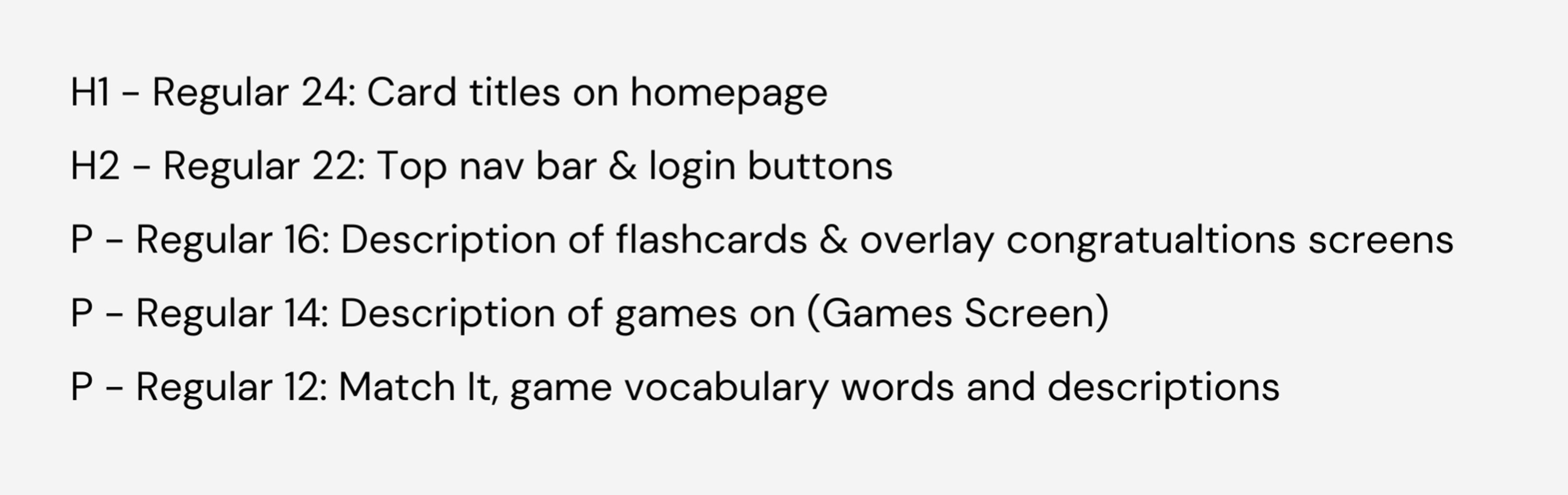
Font Choice: I decided on the typography of my app to be Rubik because it's clean, modern, and easy to read. Giving users a friendly and approachable feel.
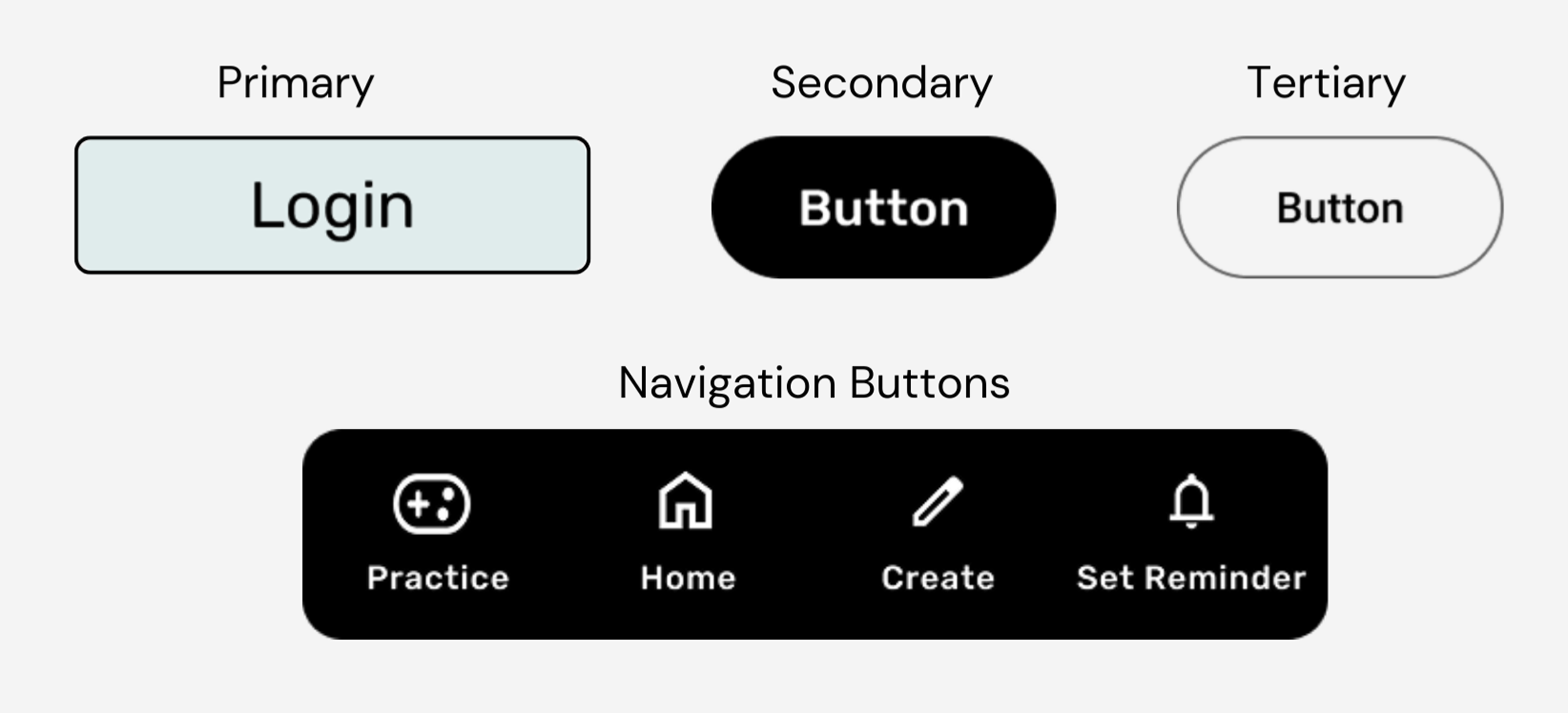
Interactive buttons for user actions
Clear iconography for navigation
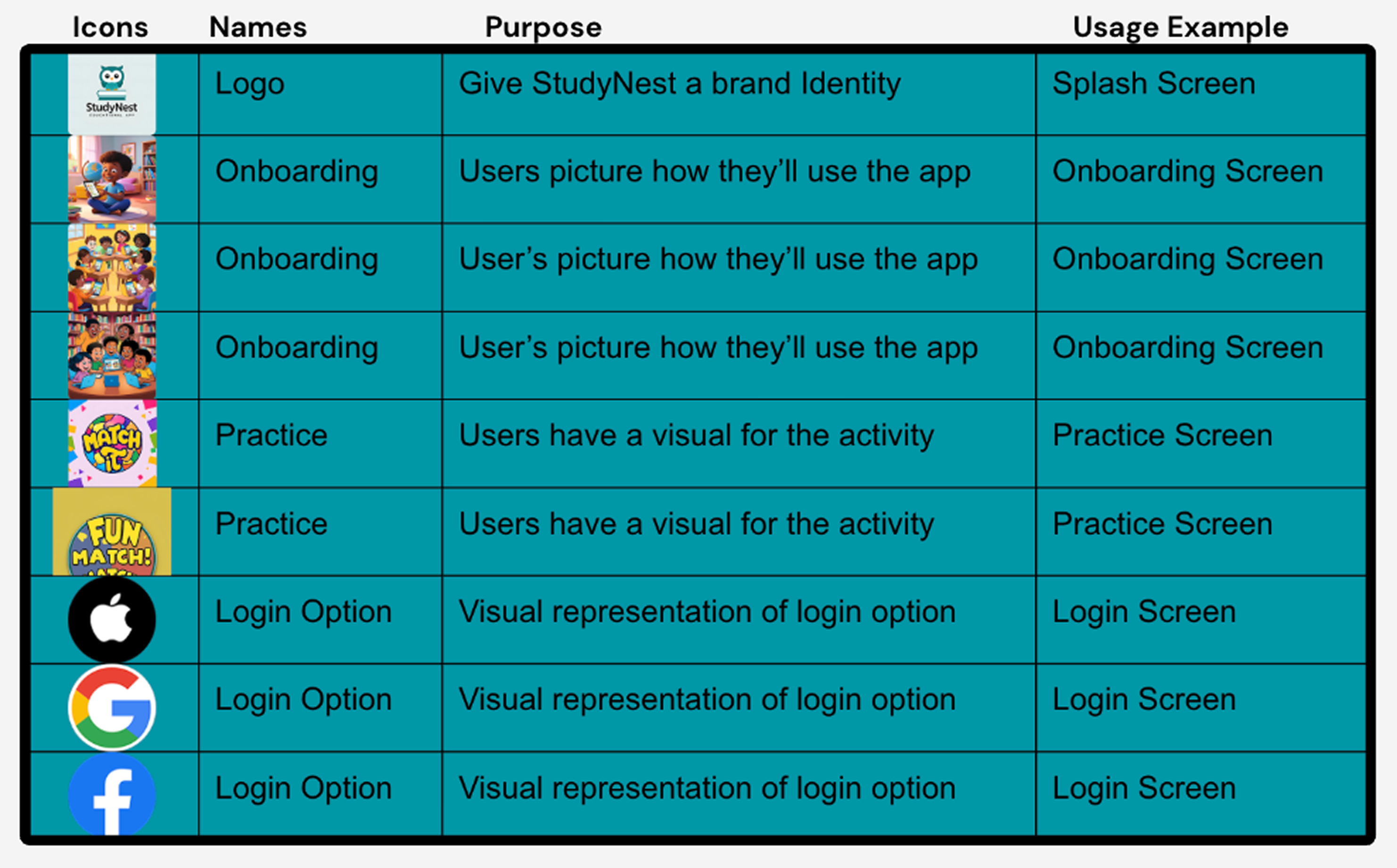
Visual elements throughout the app
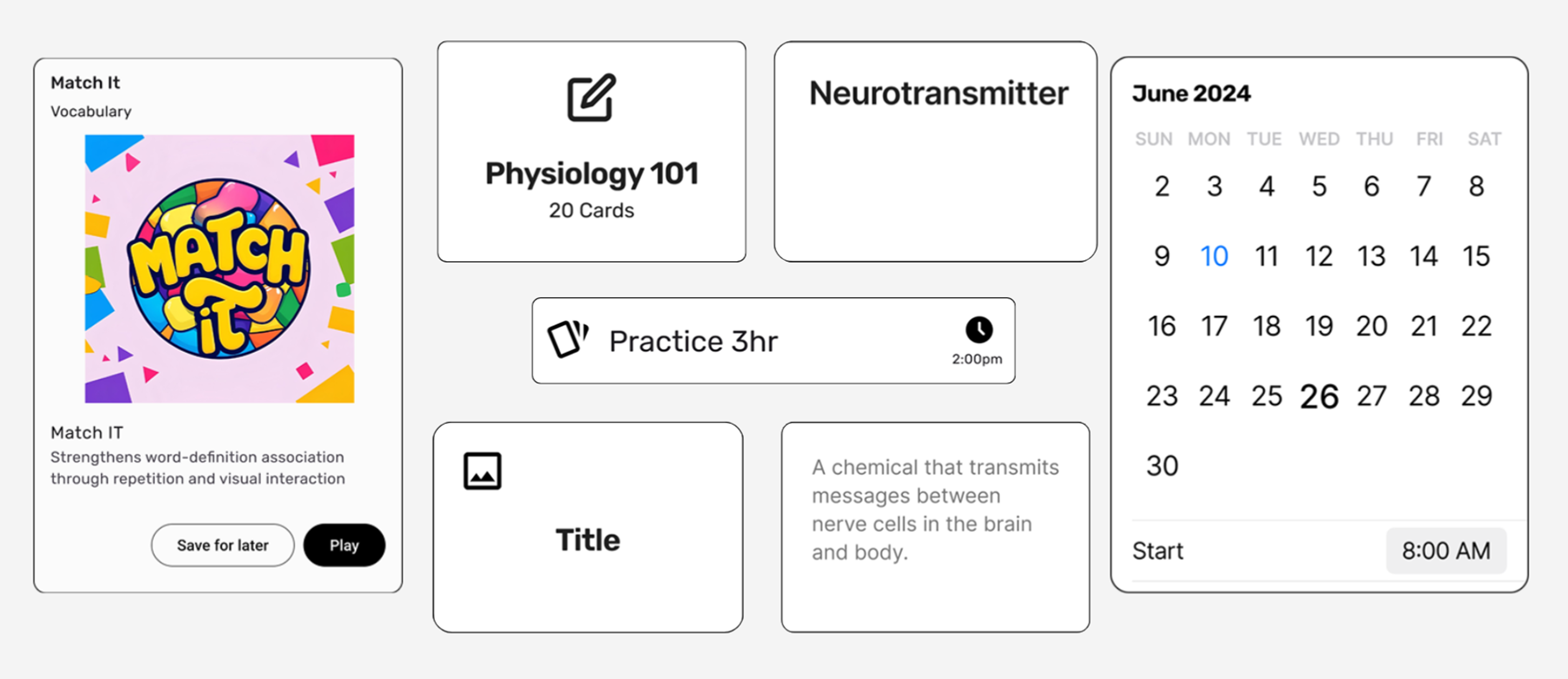
Flashcard components and containers
Layout structure and spacing
My next focus will be on refining the UI of the prototype. I plan to complete the app by adding all remaining interactive buttons and screens for a fully functional flashcard experience.
The importance of research and truly understanding who I'm designing for. There's a big difference between simply talking to users and designing with their needs in mind. The more I understand their pain points, the better I can create solutions that improve their experience.
Usability testing requires multitasking - observing users, offering assistance when needed, and taking detailed notes.
Initially, I designed based on assumptions about user needs. Usability testing revealed that I needed to improve screen transitions for a smoother experience.
After receiving feedback, I had to redesign some user flows and create additional screens I hadn't planned for, like the congratulatory screens.
Testing was delayed due to scheduling around participants' availability, which required flexibility and patience.